Steven Heller writes in the The Atlantic about type foundries and their desire to come up with new fonts. It is a fun piece to read with the memorable quote:...
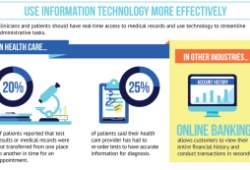
The IOM report “Best Care at Lower Cost: The Path to Continuously Learning Health Care in America” is certainly a worthwhile reading for anybody in health...
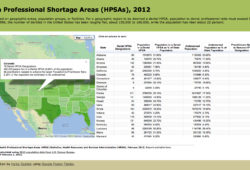
I just completed my first MOOC “Introduction to Infographics and Data Visualization” where I have learned new techniques for visualizations (see previous...
Many of you might know some things about typography. For instance, most people adhere to rules, like “Always use sans serif fonts for digital displays!” or...
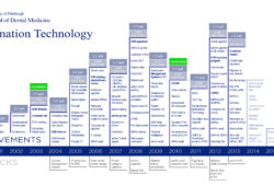
Recent history is usually boring and nobody wants to read long reports or complicated lists of events. Intrigued by an idea from Dr. Lynn Johnson, I have...
According to the Gephi Website, this free open-source graph software is an interactive visualization and exploration platform for all kinds of networks and...
This post is not about a cool visualization, but about a call for explaining science combined, potentially, with a visualization. A recent New York Times...
The technology section of the New York Times shows a video titled “Nicholas Felton: A Quantified Life” describing Nicholas Felton’s obsession with data....