
I just completed my first MOOC “Introduction to Infographics and Data Visualization” where I have learned new techniques for visualizations (see previous posts about Infographics and Data Visualization and Fusion Tables). For our capstone project, the course director, Alberto Cairo who teaches Information Graphics and Visualization at the School of Communication at the University of Miami, gave us the freedom to do whatever we want. He had us choose a topic, gather the appropriate information, and present the idea of how to show that information in graphic form, either as a static display (for print) or an interactive one (for the Web or mobile). The first assignment was to do sketches and write a short description outlining our goals and then share them in the discussion forums to get feedback from peers. We were also supposed to comment on other people’s proposals. Then, we had two weeks time to produce our infographic and post it publicly–again the assignment included to comment on the projects of our peers. My final project As dental educator working at the University of Pittsburgh, School of Dental Medicine, I am very interested in public health topics including access to care issues. Thus, I have selected data about dental HPSAs–these are Dental Health Professional Shortage Areas. A HPSA in the US is designated based on geographic areas, population groups, or facilities. For a geographic region to be deemed a dental HPSA, population to dental professional ratio must exceed 5,000:1 (4,000:1 in areas with unusually high need). Since 1990, the number of dentists in the United States has been roughly flat, about 150,000 to 160,000, while the population has risen about 22 percent. Then, I was debating if I should design a static graphic that could be used as a template for an interactive graphic, or if I should rather go for an interactive one right away. I chose the latter well aware that there are shortcomings as the Google Fusion Tables are not yet ready for prime time in my view; for instance, my interactive graphic looks good on Safari and Chrome, but renders ugly on Firefox (all on Mac OS X v 10.8.2). After setting up the Fusion Table, I combined a map and a table using the provided embed code into one Web page. One can clearly see the shortcomings as you have little control over the layout of the table as you can see on the right side of my infographic; for instance, the left-right alignment of the data is apparently random with no control, and I could not find a way to determine the column width. However, I am glad that I decided on an interactive infographic and not a static mockup as this is a useful product that I will share with fellow faculty who might be able to learn something new as it tells a story about our health care delivery system. If I had to improve it in one way, I would try to incorporate the imbalance of dentists between rural and urban areas, something which affects many people in our country, but is currently not shown in my infographic. See the interactive version or the static screenshot in Figure 1.
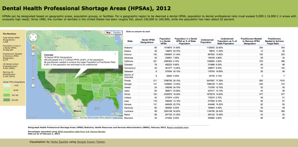
Figure 1: Dental Health Professional Shortage Areas (HPSAs), 2012
