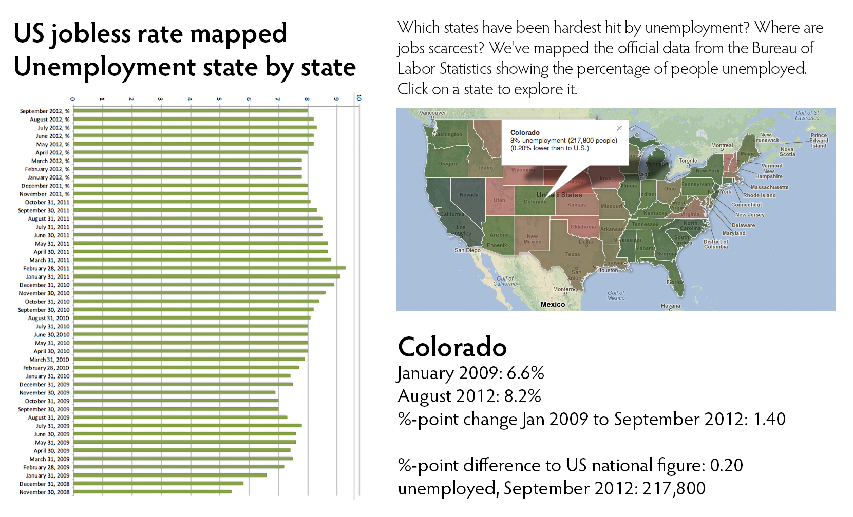
As I am still enrolled in the MOOC “Introduction to Infographics and Data Visualization” I am learning new techniques for visualizations (see previous post). This week, the course director, Alberto Cairo who teaches Information Graphics and Visualization at the School of Communication at the University of Miami, had us create a data visualization using the Guardian Data Blog as a source. We downloaded the data from that a post titled “US jobless data: how has unemployment changed under Obama?” Our goal was to get some data and think about what kind of interactive graphic you could create with them. Here my submission: After downloading the data and uploading them to Google Drive, I watched the tutorial “Getting Started with Fusion Tables.” Then, I consulted the Google support page for further information on how to edit these tables and the resulting maps. Finally, I had to find a Fusion table with the US state boundaries which was much easier than I had expected. After merging both tables and some tweaking, I ended up with this interactive graphic. See Figure 1 for a screenshot of the graphic embedded in a larger infographic which was assembled in Photoshop. If you want to play with the interactive map, go to the public version here.
Fusion Tables