Allison Morris shows on onlinecollegecourses.com an impressive infographic called “The Minds Behind The MOOCs.” I like the consistency in color and style....
Everyone in academia has received hundreds or thousands of calls for submissions in his or her career. While subject matters obviously vary, they mostly...
Hans Rosling shows in this augmented reality (AR) animation how 200 countries have developed over 200 years in regards to income and health/lifespan. He...
As I am professionally interested in all dental topics, I was intrigued by the Pew‘s infographic which shows that most states lag on dental sealants. The...
As I am still enrolled in the MOOC “Introduction to Infographics and Data Visualization” I am learning new techniques for visualizations (see previous...
For a recent Natural Language Processing paper, I have created a workflow diagram showcasing how the data was processed. The paper was published in the Journal...
When doing anything online, we increasingly experience that video seems to be the new Web. This trend is not only expressed in the rise of YouTube popularity...
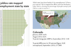
I am currently, together with more than 2,000 people, enrolled in a MOOC “Introduction to Infographics and Data Visualization.” This course is directed by...
BusinessWeek reports that President Obama has Edward Tufte appointed to help visualizing where the economic stimulus money is going. The article celebrates...