One of the most common type crimes is to use so called pseudo italics. To the defense of all who regularly use slanting instead of italic fonts, Microsoft with its popular MS-Word has lured us into slanting by placing the little “I” icon in the formatting bar. Their crime is to actually use an “I” instead of an “S” because the all what a push on this icon does is slanting. Slanting creates wide, ungainly forms of these skewed letters which makes them look forced and unnatural. The italic form of a font is not just a mechanically slanted version of the roman: it is a separate typeface. Letters have actually a different shape (Figure 1)! Photoshop calls these “Faux Italic” and they can be invoked using “SHFT+CTRL+I” when text is selected for fonts which do not come with a separate italic typeface.
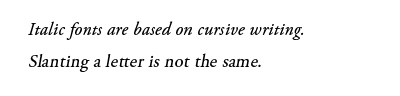
Figure 1: Compare italic font with slanting (Adobe Garamond Pro)
The same concept applies to the type crime pseudo bold which just pads around the edges making the letters look blunt and dull. Bold versions of traditional fonts were added to meet the need for emphatic forms. Again, you cannot create these using the “B” icon in MS-Word (Figure 2)! Again, Photoshop calls these “Faux Bold” and they can be invoked using “SHFT+CTRL+B” when text is selected for fonts which do not come with a separate italic typeface. Resist using them!
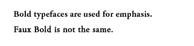
Figure 2: Compare italics and slanting (Adobe Garamond Pro).
