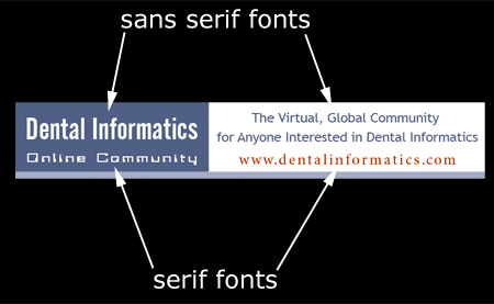
“Complementary” in regards to fonts often refers to a combination of serif font and a sans serif font. But, the creative combination of both is often the tricky. See Figure 1 for an example of the combination of a serif with a non-serif font for a logo for an online community.

Figure 1: DIOC logo with serif and sans serif fonts
Note: If you use non-standard fonts install these fonts on presentation machine (or embed fonts in presentation). In general, nothing renders fonts as well as Adobe Acrobat Reader. Thus, consider displaying a full screen PDF show instead of PPT.

