Everyone in academia has received hundreds or thousands of calls for submissions in his or her career. While subject matters obviously vary, they mostly display one common characteristic: confusing. The combination of different types of submissions, like posters versus papers, combined with different deadlines applicable for these submission types as well as different lengths of abstracts or papers required for their submission makes for a complex message. This message is often transmitted using lengthy explanations that are hard to digest; or using short bullet point-like fragments that are easier to read, but often lack the necessary details. I was recently surprised to find the obvious solution to this dilemma: a visualization to help clarify the range of submission types. Dr. Jessica Tenenbaum, the Scientific Program Committee Chair for the American Medical Informatics Association 2013 Joint Summits on Translational Bioinformatics and Clinical Research Informatics (http://www.amia.org/jointsummits2013) came up with the idea. She put together the graphic in MS Visio using mostly existing “shapes” from the workflow category. She added the poster, and the podium from other sources. I hope that this visual representation of a call for submission inspires other conference organizers.
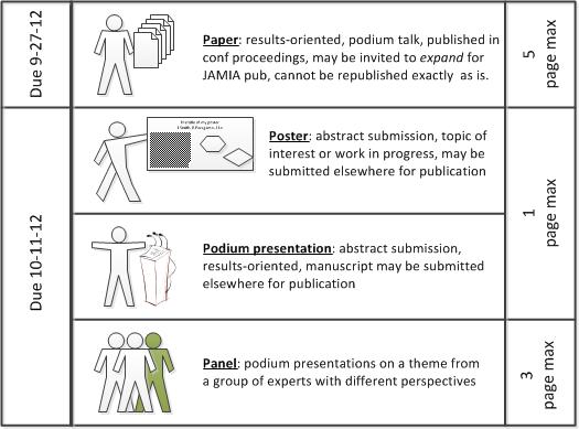 Figure 1: Call for Submission
