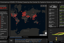
Coronavirus COVID-19 Global CasesVisualised by the Center for Systems Science and Engineering (CSSE) at Johns Hopkins University (JHU): Click here for live...
For a peer-reviewed publication which will appear in print as well as digitally, we need to show part of a user interface. While it is easy to create a...
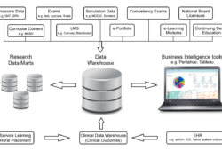
During the 2016 AADR/CADR Annual Meeting in Los Angeles, California, a panel discussion about Big Data in Dental Research and Dental Education took place...
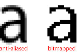
Anti-aliasing is an often-used term when talking about text on a screen. The technique uses shades of gray to create the illusion of a curved edge. It is...
Recently, the results from the dental curriculum survey were updated to provide dental schools with an internal benchmarking tool that monitors compliance with...
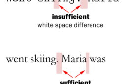
Many learned to make two spaces behind a sentence in school, but you are not using a typewriter anymore, so just insert one space. Why space-space is a no-no?...
I will travel to Birmingham, UK during the next week to present at the British Association of Oral Surgeons Study Day a series of seminars devoted to...
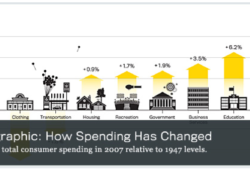
I am increasingly interested in infographics to tell stories. Steven Rose published a recent article in The Atlantic about where our money goes compared with...
There are some typographical rules when it comes to dashes, following or violating them can be easily spotted and is often used as first indicator for...
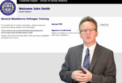
Our school recently introduced a new software application “Credential Keeper” which is supposed to streamline the credentialing process of employees and...