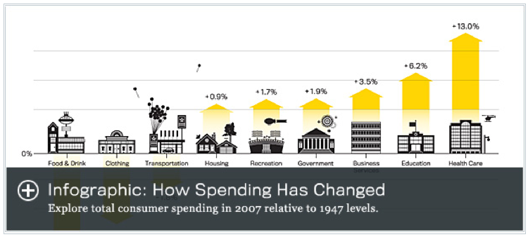
I am increasingly interested in infographics to tell stories. Steven Rose published a recent article in The Atlantic about where our money goes compared with that of our parents or grandparents. The resulting data is surprising, but the real story can be best told with the embedded infographics (see Figure 1). The two infographics have been developed by Kiss Me, I’m Polish, a creative studio specializing in branding, interactive and editorial design. Their interesting work can be seen here.
Infographic: How We Spend