Yesterday, I was preparing a poster for the “2010 CTSA Informatics Key Function Committee All-Hands Meeting” held at the Natcher Auditorium, NIH campus in Bethesda, MD on October 13-14, 2010. We will showcase some usage data of Digital Vita, an application developed by the University of Pittsburgh, which integrates CV management functions with academic social networking and basic research team management and collaboration functions. Initially, the graphs were created using basic functions in Microsoft Excel (see example in Figure 1):
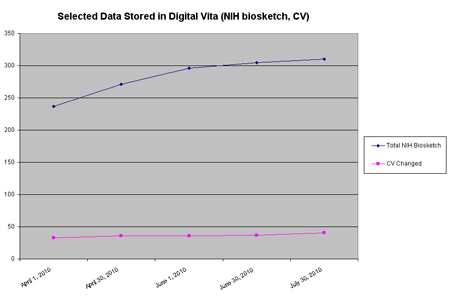
Figure 1: NIH Biosketches in DV – MS Excel
I have converted these graphs into Photoshop, replacing the non-data-bearing frame with a y-axis indicating the range and changing the graph type to reflect that we combine cumulative data and non-cumulative data in one chart. In addition, I have labeled the data directly instead of using a legend reducing the cognitive load for the viewer. I first made a screen shot of the Excel graph and imported it into Photoshop, then I used the vector graph shape tools to draw the chart allowing me to scale it without quality loss. I ended up creating several 700 pixel high JPEGs which I inserted into a Microsoft PowerPoint poster template used by our Department of Biomedical Informatics (see example in Figure 2).
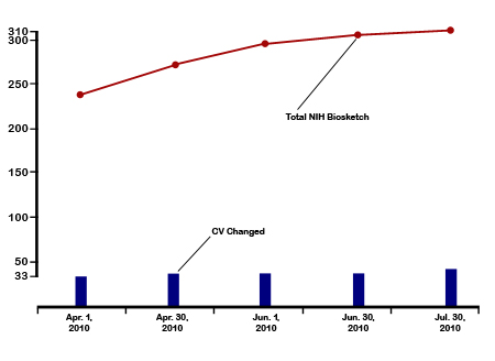
Figure 2: NIH Biosketches in DV — Adobe Photoshop
