Many of you might know some things about typography. For instance, most people adhere to rules, like “Always use sans serif fonts for digital displays!” or “Never use italic type on the Web.” However, there’s more to typography than just following a few rules. Actually, there are many rules and some of them are more relevant than the others. Here is the first important rule or concept: Hanging Punctuation! Hanging (aka “Hung”) punctuation means that left aligned (or, for that matter any vertically aligned blocks of text, but lets stick with left for the explanation) need to be extended when they begin with punctuation marks, like a quotation mark. Without that adjustment, a left aligned text in a text block will appear indented (Figure 1).
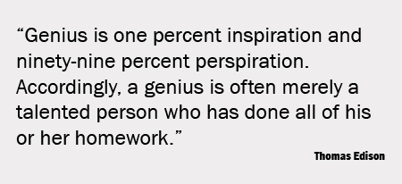
Figure 1: Poorly aligned quotation marks.
Compare the same text block with proper typography adhering to the principles of hanging punctuation (Figure 2). I would recommend to follow this rule when working on headlines or sub headings and do not bother with it when you deal with a long text because this kind of manual adjustment would make a lot of extra work. Another tip along the same lines is to dramatize the quote by setting the quotation marks larger than the type. I would do something like that, for instance, on a scientific poster about a qualitative study where I cite verbatim quotes from my subjects.
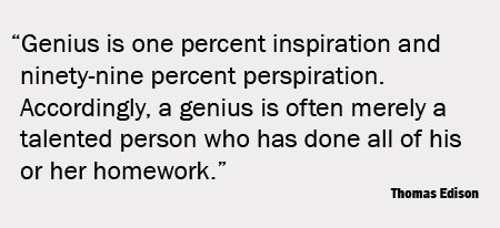
Figure 2: Properly aligned quotation mark. Note that the left margin looks much better now.
If you want to learn more about this subject, take a look at the bible of typography “The Elements of Typographic Style” by Robert Bringhurst. PS (3/23/2009): I just read a blog from CreativePro about the same topic. They noted that in Adobe InDesign you can specify that hanging quotes should always be used by checking “Optical Margin Alignment” which can be accessed in the Story palette, which is located under Type in the main menu.
